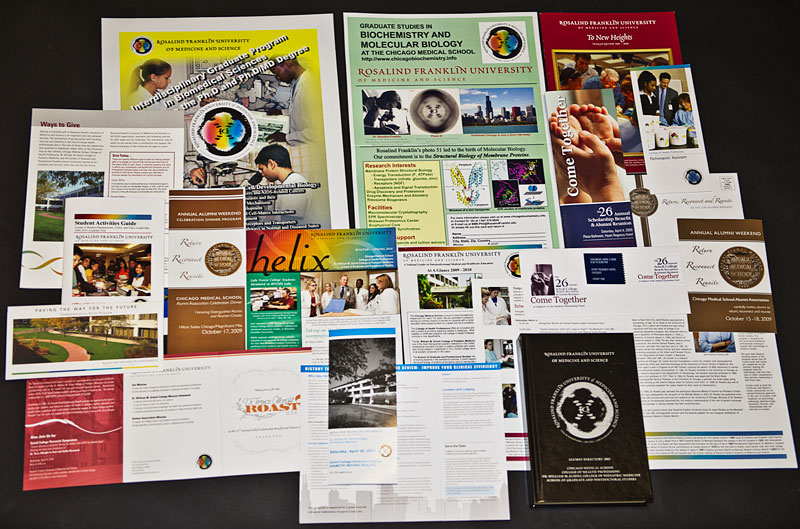
Marketing materials in circulation before the refresh.
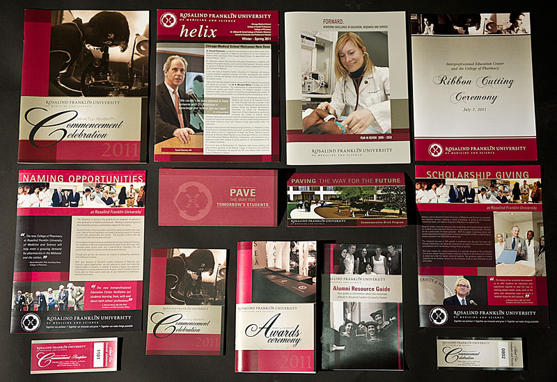
Marketing materials in circulation after the refresh.
Brand guide used between 2004-2009 (excerpts).
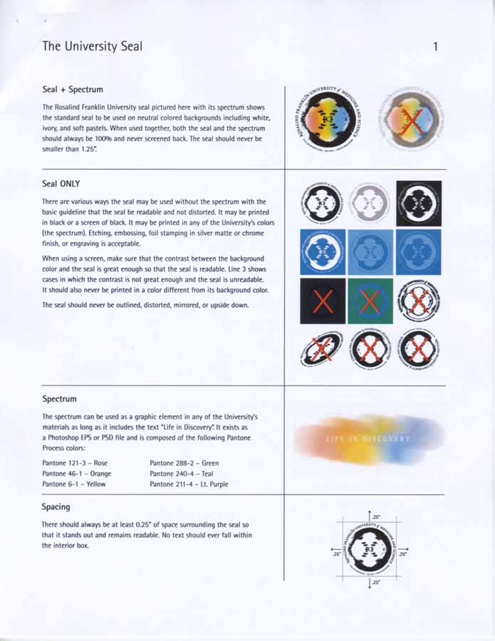
PROBLEM: The seal with a rainbow (spectrum) background was used extensively as the logo.
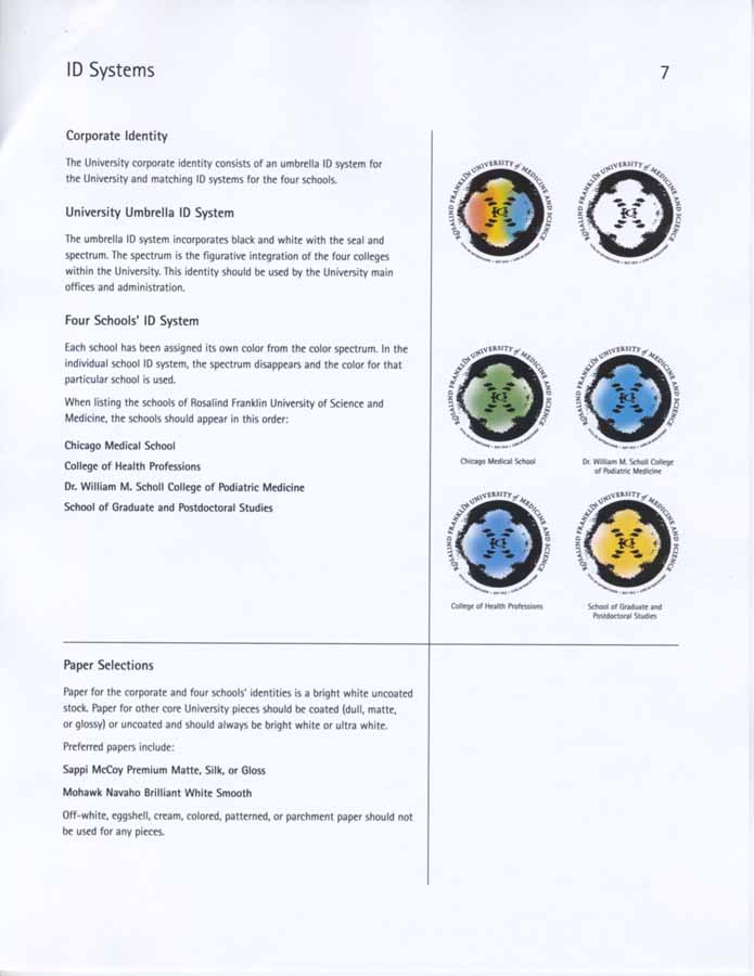
PROBLEM: Then each college/School had its own brand architecture, which were used instead of the parent brand even though they all had the same audience. The college/school specific architecture was officially dropped in 2007, but some people and departments continued to use it anyway.
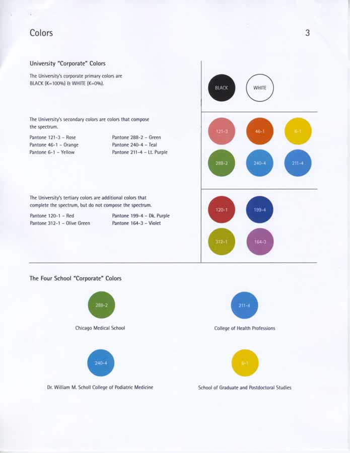
PROBLEM: The color palette assigns the primary color for the university as black and white. Additional colors are identified for the colleges/schools and it is unclear how the secondary and tertiary colors are to be used.
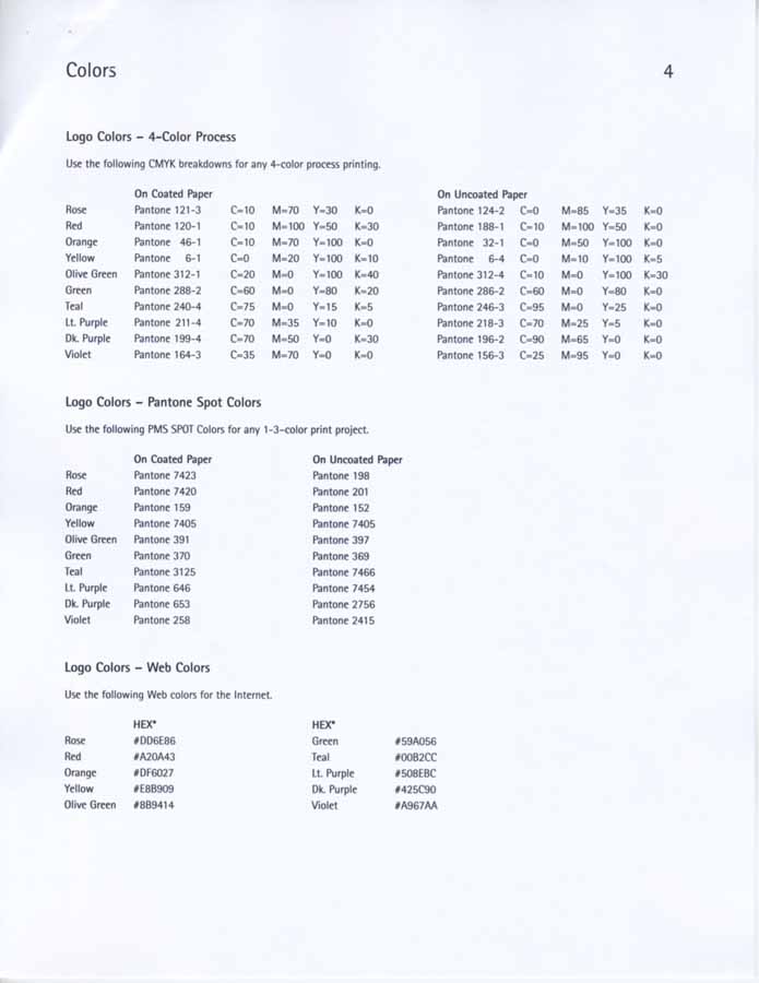
PROBLEM: Process, spot and web designations for all of the colors were assigned. How does it help people working in Microsoft Office achieve brand color consistency?
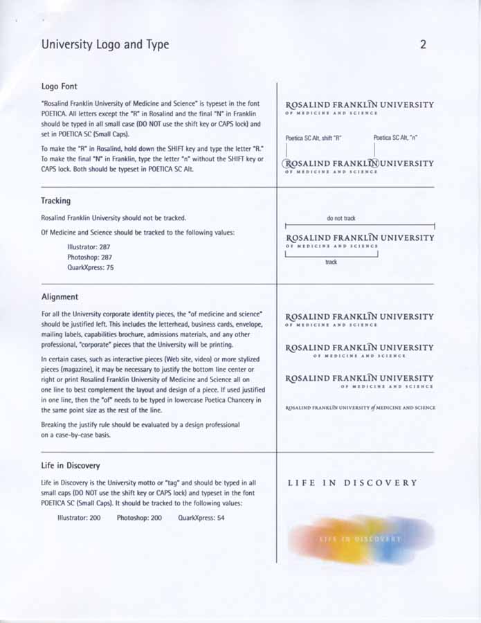
PROBLEM: The University's word mark and motto is discussed, but no indication how any of these four alignments are to be used, or the spacing between elements in a lock up with the logo and college/school name.
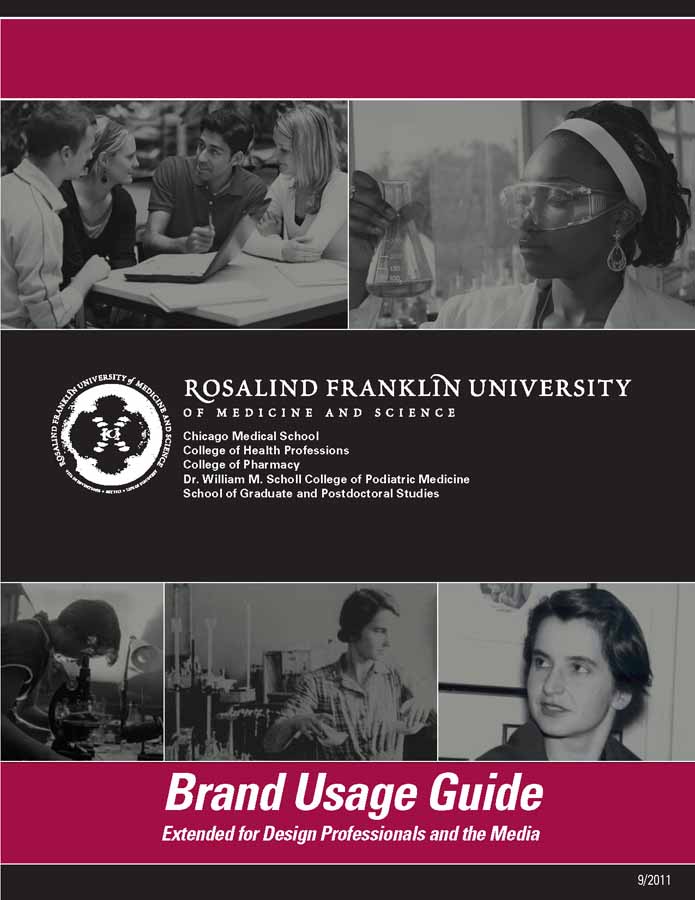
The University's Refreshed Brand Guide 2010-2015 (excerpts).
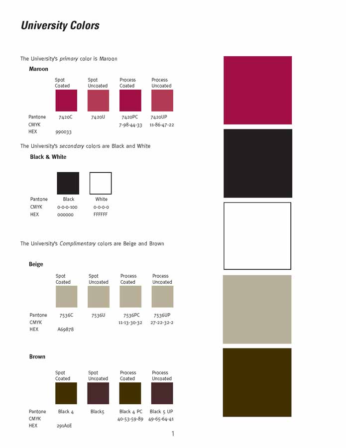
SOLUTION: I choose Maroon as the primary color for the university demoting black and white to a secondary status, and designated beige and dark brown as complimentary color choices. Process, spot and web values are given with these large swatches.
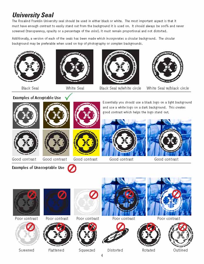
SOLUTION: I dropped the rainbow seal so that the logo would be either black or white and reduce the cost on business cards and letterhead when commercially printed using two color. Proper usage is also discussed
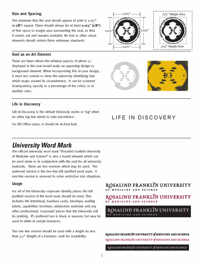
SOLUTION: Sizing and spacing the logo element and use as an art object is clear. I cut the number of word marks down from four to two, a left justified and a one line version showing proper usage.
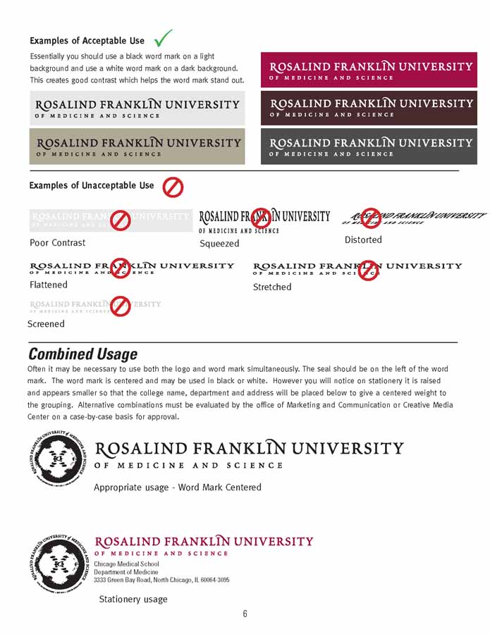
SOLUTION: Usage of the word marks and combined lock up is clarified.
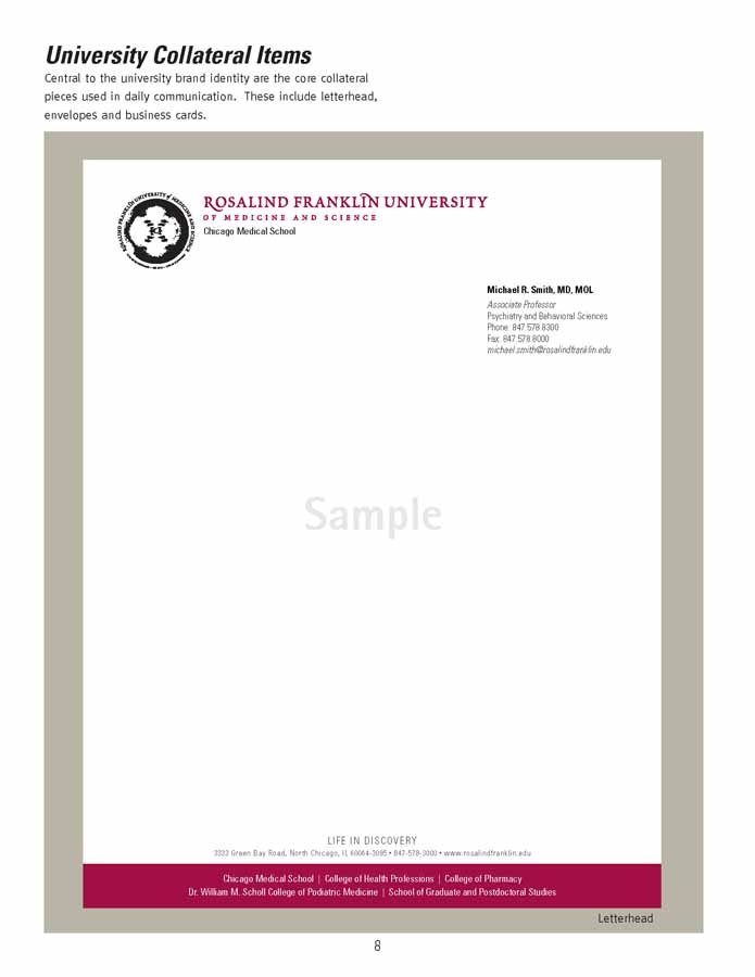
SOLUTION: The University's new refreshed letterhead I designed is shown as a standard usage example.
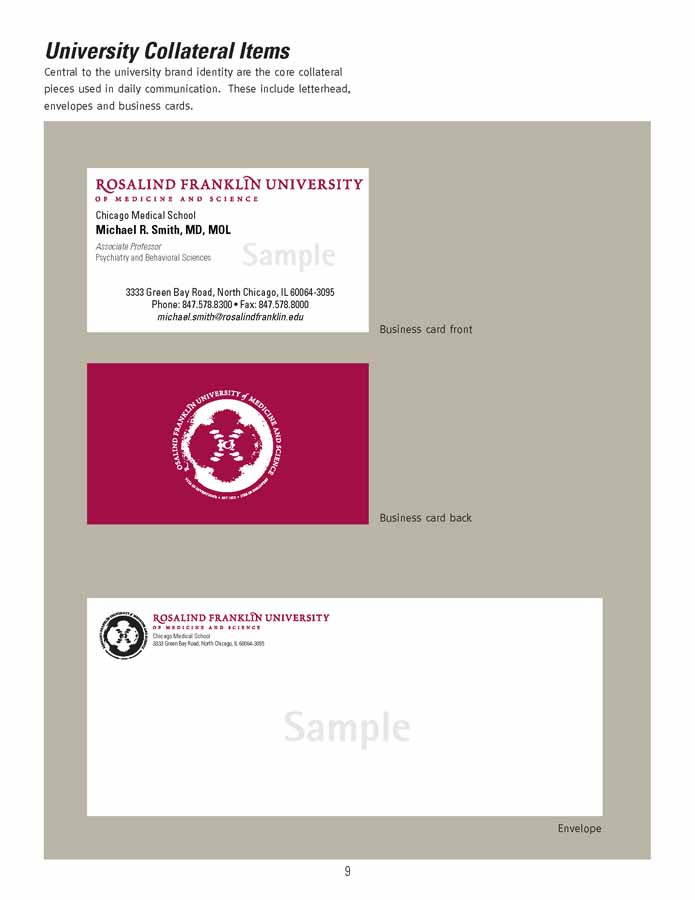
SOLUTION: The University's new refreshed business cards and envelope I designed is shown as a standard usage example.
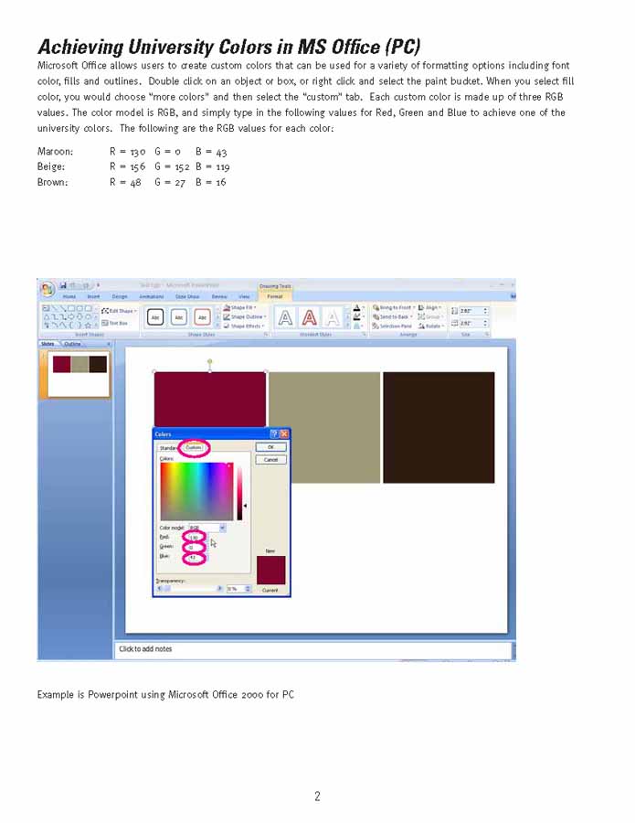
SOLUTION: How to achieve the brand colors with MS office is clearly defined.
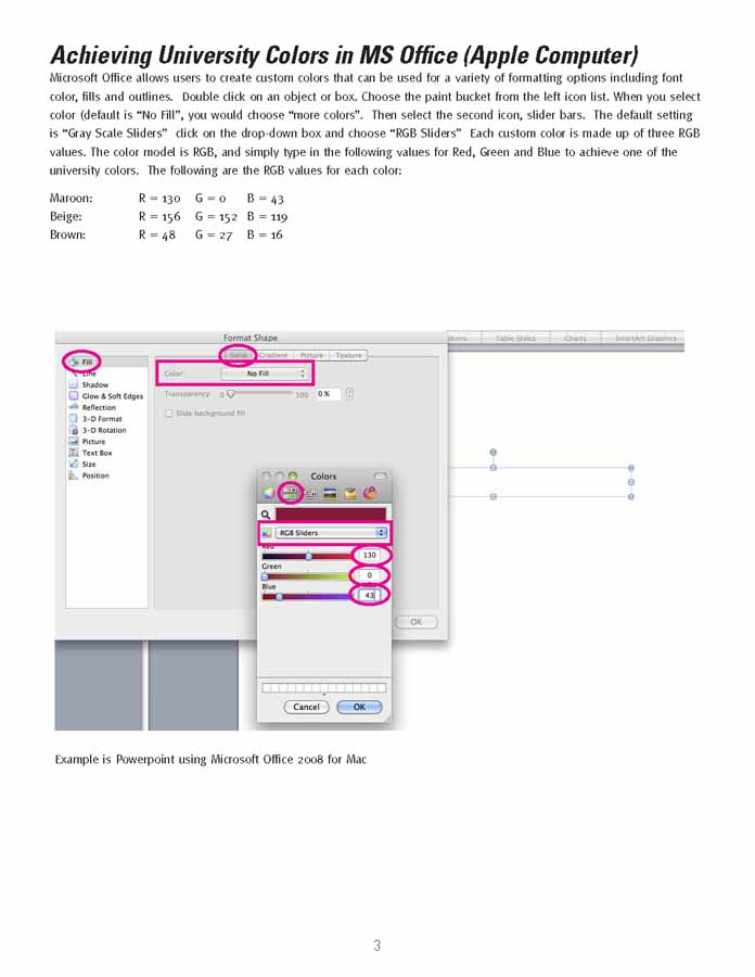
SOLUTION: How to achieve the brand colors with an Apple computer is clearly defined.
When I arrived at the university, they had a brand that was simply broken. It had no coherence, no attempt at consistency, and lacked any meaningful strategy that would hold it together and create a unified brand identity that would appear seamless to its audiences.
Rosalind Franklin University
2010
Analyzing the brand guide being used uncovered inherent flaws, that ultimately needed to be changed in order to save this fractured brand.
The first step was to tackle color. When a brand does not have a primary color designated, it essentially has no defining color basis at all. Having a mix of other colors in palette only amplifies this problem. Color is then chosen by people based on their personal likes, rather than rationale. Having a rainbow 'spectrum' in the logo also reinforced the 'any color you want to choose' approach as being valid across the institution.
I chose to only have RFU use either the black or white version of the logo, and to define the primary color as maroon. This maroon color had been used on a few mission/vision pieces and some university posters, so I felt it was a strong dignified color that already had some use and acceptance. Next collaborating with my art director we looked at many colors and combinations to find the perfect solution. We added beige and chocolate brown as two neutral colors to compliment the primary, but not compete with it. By limiting the color palette this way, we can train the staff to stop thinking on terms of a mix of colors so that in the future more colors could be added carefully, preventing a return to rainbow and loss of cohesion.
I reduced the number of word marks to just two, a left justified and a one line version. I clearly depicted its correct use, and how it should not be used along with the logo. I then depicted how they would be used together to form our signature. It is then used as a lock up with our college/school names on various collateral including examples of the letterhead, business card and envelope, which now are produced as two color printing, versus four color due to the spectrum.
Lastly, I defined how these colors could be achieved in Microsoft Office for both PC's and Apple in order for the university to achieve a unified color use. The marketing department created a large number of MS Office templates based on this to help departments implement the new brand. By solving the many problems in the original brand guide I was able to put this brand back on track. The brand refresh was a big success and repaired the brand of the university.
This brand refresh won a Gold Marcom Award in 2011, by the Association of Marketing Professionals.
Rebranding, Editing, InDesign, Photoshop, Illustrator