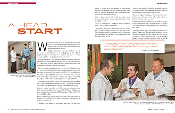
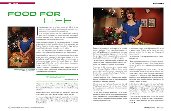
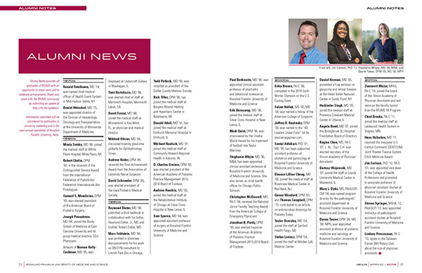
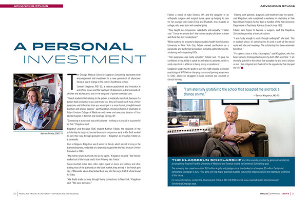
The Helix was actually a bi-annual newsletter with a very bad rainbow motif that incorporated various color blocks and poor type. We had redesigned it to a maroon color scheme and improved look in 2011.
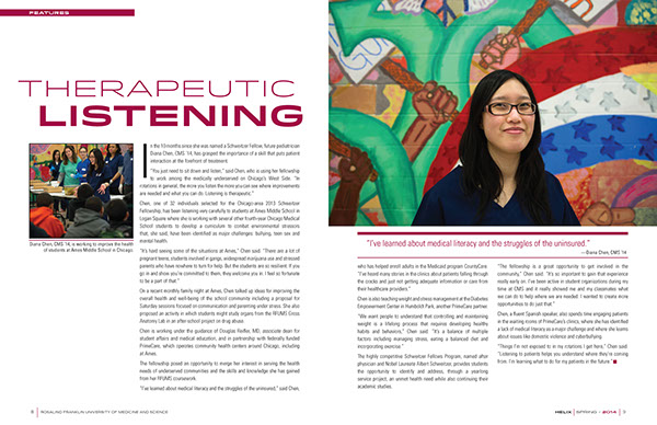
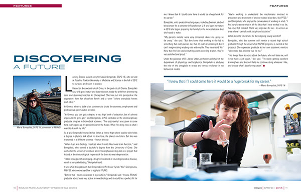
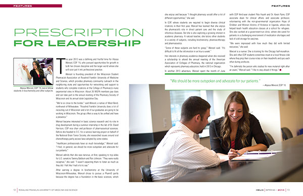
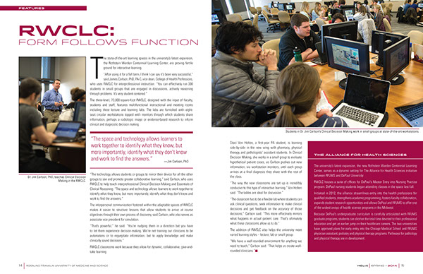
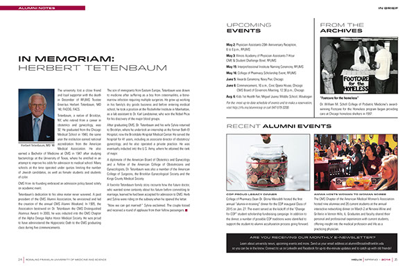
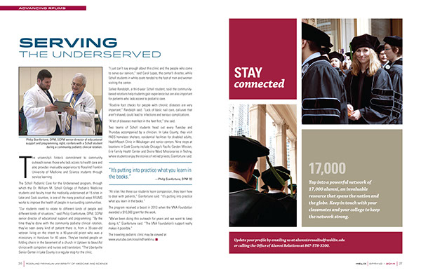
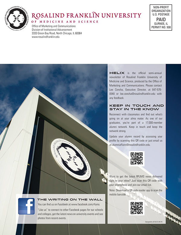
The goal was to create a whole new look and convert the Helix from a simple 12-page newsletter to a larger 28-page bi-annual Alumni magazine, that everyone in the campus community would want to read and look forward to future issues.
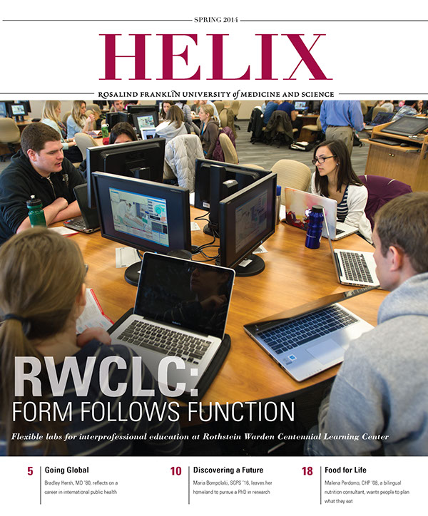
Rosalind Franklin University of Medicine and Science
Spring 2014
The cover design is very modern with a large photo and great balance of white space to be attractive at first glance. While the main photo is captioned for the main editorial piece of the issue, the three additional editorial sections are informative of content without adding too much visual weight to the design.
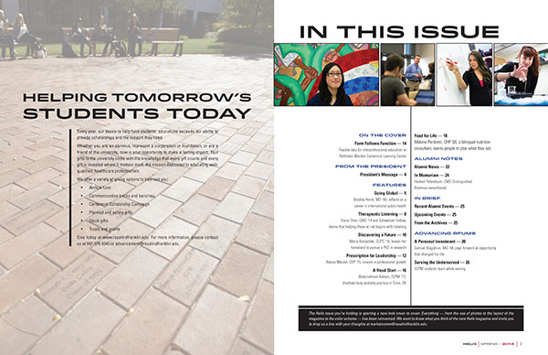
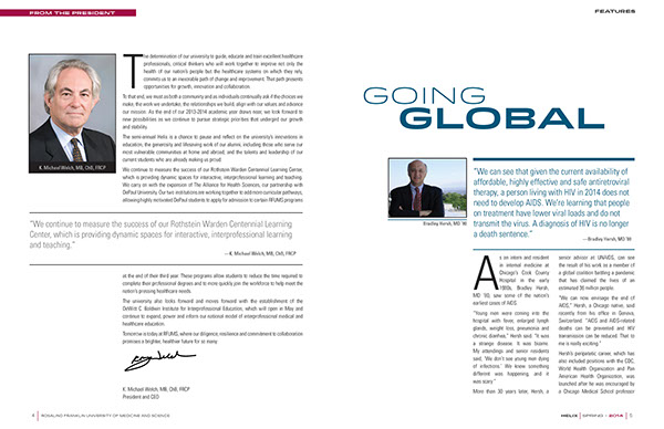
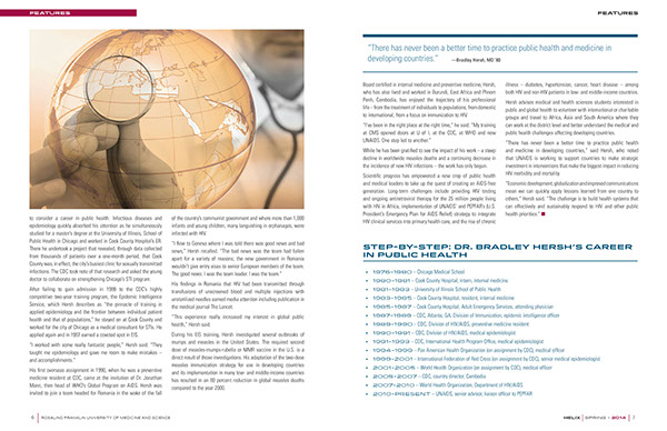
The layouts are consistent of modern alumni magazine looks, and the editorial content had to be reduced in some of the features to allow for the use of creative white space allowing the reader to have breathing room and not feel overwhelmed with content. The magazine was a huge success and the initial print run was consumed within two days. Because of demand a second printing was necessary. Demand for this publication grew by 30%.
This redesign won three awards.
Photography, Photo retouching, Photoshop, InDesign